
CSS 애니메이션: 소개 및 예
게시 됨: 2022-04-12 CSS에서 가장 기본적인 애니메이션 효과는 transform 및 transition 과 같은 속성을 통해 얻을 수 있습니다. 그러나 CSS 애니메이션 레벨 1 작업 초안은 animation 및 @keyframes 속성을 활용하여 영구적인 애니메이션 효과를 구현함으로써 보다 복잡한 환경을 제공합니다. 이것은 확실한 예를 통해 가장 잘 이해됩니다.
@keyframes를 사용하여 애니메이션 규칙 지정
@keyframes 규칙은 페이지 레이아웃의 애니메이션 식별자에 적용하려는 애니메이션 동작을 지정하는 데 사용됩니다. 식별자는 animation-name 또는 animation: name; 속기.
@keyframes change-color { from { background-color: #fff; } to { background-color: #000; } } 이러한 맥락에서 위의 예는 애니메이션이 지속되는 동안 background-color 을 흰색에서 검은색으로 변경합니다. from 은 시작(0%)을 나타내고 to 는 끝(100%)을 나타냅니다. 따라서 규칙을 백분율 값으로 다시 작성할 수도 있습니다.
@keyframes change-color { 0% { background-color: #fff; } 50% { background-color: #f3f3f3; } 100% { background-color: #000; } } 애니메이션 효과를 주고자 하는 요소를 지정하지 않는 한 이것 자체로는 아무 일도 하지 않습니다. 또한 기본값이 0이므로 animation-duration 도 지정해야 합니다.
.container { width: 100vh; height: 100vh; animation-name: change-color; animation-duration: 5s; /* we can also rewrite this using a shorthand animation: change-color 5s; */ }그런 다음 div를 사용하여 컨테이너를 호출할 수 있으며 결과는 다음과 같습니다.

일반적으로 순수 CSS로 작성된 대부분의 CSS 애니메이션은 여러 줄의 애니메이션 논리를 작성하지 않아도 되므로 속기를 사용합니다. 따라서 다음은 animation 속성 값에 대한 참조입니다.
animation-name: name; /* the name of the specific animation (to animate with @keyframes) */ animation-duration: 10s; /* the duration */ animation-timing-function: linear; /* the veolcity curve for the animation */ animation-delay: 1s; /* set a delay for the animation playback */ animation-iteration-count: infinite; /* set it to an infinite loop */ animation-direction: alternate; /* back and forth, use normal for default direction */ animation-fill-mode: both; /* direction to apply the style */ animation-play-state: paused; /* also accepts 'running' */추가 읽기
CSS 애니메이션에 대해 더 자세히 알고 싶다면 여기 제가 추천하는 리소스가 있습니다.
- Codrops CSS 참조 – 이것은 Sara Soueidan(@SaraSoueidan)이 작성하고 구성한 광범위한 참조이며 특정 CSS 속성이 작동하는 방식에 대한 심층 예제를 포함합니다.
- MDN CSS 애니메이션 – MDN 웹 문서 페이지에서 CSS 애니메이션에 대한 광범위한 문서 스타일 소개입니다.
- 큐빅 베지어() 소개 – 고급 CSS 애니메이션을 만들기 위해
cubic-bezier()속성을 사용하는 방법에 대해 CSS-Tricks를 위해 Temani Afif(@ChallengesCss)가 작성한 심층 기사입니다.
CSS 애니메이션의 예
무엇이든 배우는 가장 좋은 방법은 예제를 통해 배우는 것입니다. 다음 섹션은 전적으로 CSS 애니메이션 속성을 통해 얻을 수 있는 다양한 효과에 대한 것입니다.
마지막 한가지! 아래의 많은 예제 애니메이션에는 관련 코드가 상당히 많습니다. 따라서 스크롤 막대를 활성화하기 위해 이 문서에 최대 높이 오버플 로를 추가했습니다. 각 코드 조각 위로 마우스를 가져간 다음 클립보드에 복사하여 코드 편집기로 가져올 수도 있습니다.
파도

웨이브 애니메이션은 먼저 웨이브 패턴에 대한 SVG 경로를 그린 다음 ID를 할당하여 생성됩니다. 그런 다음 사용자 지정 animation-delay 및 animation-duration 변수를 사용하여 4개의 nth-child 클래스를 지정합니다. 각 변수는 애니메이션 내부의 개별 웨이브를 나타내며 각 웨이브는 독립적으로 스타일을 지정할 수 있습니다.
SVG로 패턴을 정의할 때의 장점은 코드를 쉽게 재사용할 수 있다는 것입니다.
우리가 그린 경로를 보면 사용자 정의 축을 사용하여 웨이브에 대해 4개의 다른 레이어를 지정한 다음 초기 경로에 대해 설정한 #wave-pattern id를 참조합니다. 여기에서 각 웨이브의 색상 모양을 변경할 수도 있습니다.
HTML
<div class="your-container"> <svg class="css-waves" xmlns="http://www.w3.org/2000/svg" xmlns:xlink="http://www.w3.org/1999/xlink" viewBox="0 24 150 28" preserveAspectRatio="none" shape-rendering="auto" > <defs> <path id="wave-pattern" d="M-160 44c30 0 58-18 88-18s 58 18 88 18 58-18 88-18 58 18 88 18 v44h-352z" ></path> </defs> <g class="animated-waves"> <use href="#wave-pattern" x="48" y="0" fill="rgba(155,255,255,0.7"></use> <use href="#wave-pattern" x="48" y="3" fill="rgba(155,255,255,0.5)"></use> <use href="#wave-pattern" x="48" y="5" fill="rgba(155,255,255,0.3)"></use> <use href="#wave-pattern" x="48" y="7" fill="rgba(155,255,255,0.3)"></use> </g> </svg> </div>CSS
.css-waves { position: relative; width: 100%; height: 15vh; margin-bottom: -7px; min-height: 100px; max-height: 150px; } /* Here we declare the SVG node that we wish to animate. */ .animated-waves > use { animation: infinite-waves 25s cubic-bezier(0.55, 0.5, 0.45, 0.5) infinite; } .animated-waves > use:nth-child(1) { animation-delay: -2s; animation-duration: 7s; } .animated-waves > use:nth-child(2) { animation-delay: -3s; animation-duration: 10s; } .animated-waves > use:nth-child(3) { animation-delay: -4s; animation-duration: 13s; } .animated-waves > use:nth-child(4) { animation-delay: -5s; animation-duration: 20s; } @keyframes infinite-waves { 0% { transform: translate3d(-90px, 0, 0); } 100% { transform: translate3d(85px, 0, 0); } } /* Mobile Optimization */ @media (max-width: 768px) { .css-waves { height: 40px; min-height: 40px; } }텍스트 로드 중

이 로딩 효과는 몇 가지 실용적인 애니메이션 속성만 사용하기 때문에 비교적 쉽게 구현할 수 있습니다. 먼저 content: attr() 값을 지정한 다음 애니메이션을 적용하려는 텍스트 요소에 적용합니다. 그 다음에는 애니메이션 자체를 지정합니다. 이 경우에는 animation: loading 5s linear infinite; .
로딩 효과의 지속 시간은 5s 속성을 변경하여 수정할 수 있습니다. 마지막으로 @keyframes 를 사용하여 로딩 애니메이션을 호출하고 해당 5초 동안 너비를 0%에서 100%로 변경합니다. 애니메이션 지속 시간 값이 높을수록 로딩 효과가 느려집니다.
이와 같은 애니메이션의 특정 사용 사례는 페이지 로드를 위한 전환 효과이지만 라이브러리에 의존하고 싶지 않을 때 애플리케이션 프로젝트를 위한 안정적인 솔루션이기도 합니다.
HTML
<!-- the loading-text class is specified through the content: attr(); property. change the value name to implement multiple design variations, or reuse the same class to show the loading effect in other parts of your design --> <h2 loading-text="Loading...">Loading...</h1>CSS
h2 { position: relative; font-size: 5em; color: rgb(199, 255, 110); text-transform: uppercase; border-bottom: 10px solid #ffffff; line-height: initial; } h2::before { content: attr(loading-text); position: absolute; top: 0; left: 0; width: 100%; color: #b0a8e2; overflow: hidden; border-bottom: 10px solid #b0a8e2; animation: loading 5s linear infinite; } @keyframes loading { 0% { width: 0; } 100% { width: 100%; } }텍스트 웨이브
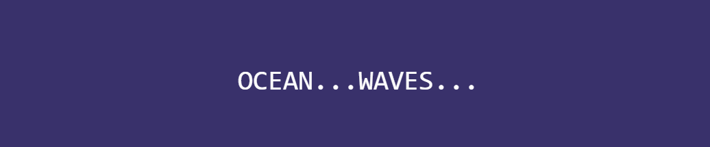
이 애니메이션에 대해 가장 먼저 알 수 있는 것 중 하나는 유동성 입니다. 이것은 calc() 함수를 사용하여 각 전환을 수학적으로 계산하기 때문에 가능합니다. 순수 CSS로 애니메이션을 작성하기 때문에 애니메이션의 각 연속 문자를 지정하기 위해 여러 span 요소를 사용해야 합니다.
파도의 깊이를 수정하려면 먼저 지속 시간을 3초에서 더 작거나 큰 숫자로 변경할 수 있습니다. 높을수록 웨이브 효과가 느려지고 그 반대의 경우도 마찬가지입니다. 그리고 @keyframes 내에서 -24px 사양을 변경하여 파도의 높이를 변경할 수 있습니다.
음수 값이 높을수록 웨이브 효과가 더 두드러집니다.
HTML
<div class="blwb"> <span style="--i:1">O</span> <span style="--i:2">C</span> <span style="--i:3">E</span> <span style="--i:4">A</span> <span style="--i:5">N</span> <span style="--i:6">.</span> <span style="--i:7">.</span> <span style="--i:8">.</span> <span style="--i:9">W</span> <span style="--i:10">A</span> <span style="--i:11">V</span> <span style="--i:12">E</span> <span style="--i:13">S</span> <span style="--i:14">.</span> <span style="--i:15">.</span> <span style="--i:16">.</span> </div>CSS
.text-wave { margin: auto; display: flex; align-items: center; justify-content: center; position: relative; } .text-wave span { position: relative; color: rgb(255, 255, 255); font-size: 40px; font-family: monospace; animation: wave 3s ease-in-out infinite; animation-delay: calc(.1s*var(--i)); } @keyframes wave { 0% { transform: translateY(0px); } 20% { transform: translateY(-24px); } 40%, 100% { transform: translateY(0); } }펄스/파급 효과
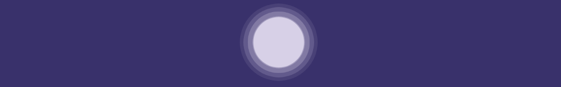
효과를 적용하려는 원에 대한 컨테이너를 만드는 것으로 시작합니다. 이것은 데모에만 해당되지만 페이지의 다른 모든 요소에 대해 코드를 재사용할 수 있습니다. 그런 다음 애니메이션 파급 효과로 사용할 .circle 이라는 클래스를 만듭니다.
이 클래스에서 사용하는 두 가지 주목할만한 속성은 opacity: 0.5; 및 animation: ease-out; . 불투명도는 잔물결/펄스가 있는 것 같은 환상을 만드는 것이며, 이즈아웃 전환은 이러한 잔물결을 원래 컨테이너에서 쉽게 나오게 합니다.
다음으로 .circle 클래스를 가져와서 nth-of-type() 속성을 적용합니다. 이 예에서는 원래 컨테이너에서 벗어나는 3개의 개별 원을 사용하고 있습니다. nth-of-type 호출 내에서 -0.5s;-1s;-1.5s 값으로 animation-delay 를 적용합니다. 음수 값이 높을수록 효과가 완전히 렌더링되는 데 더 오래 걸립니다.
마지막으로 지정된 펄스 애니메이션에 @keyframe을 적용합니다. 이 예에서는 transform: scale() 속성을 사용합니다. 이것은 각 애니메이션의 펄스 크기를 정의합니다. 값이 높을수록 나가는 물결이 더 크게 나타납니다.
HTML
<div class="pulse-effect"> <div class="circle"></div> <div class="circle"></div> <div class="circle"></div> <div class="circle"></div> </div>CSS
.pulse-effect { background-color: #f6efffa1; height: 100px; width: 100px; border-radius: 100%; position: relative; margin: auto; } .circle { position: absolute; background-color: inherit; height: 100%; width: 100%; border-radius: 100%; opacity: 0.5; animation: pulse 3s ease-out infinite; } .circle:nth-of-type(1) { animation-delay: -0.5s; } .circle:nth-of-type(2) { animation-delay: -1s; } .circle:nth-of-type(3) { animation-delay: -1.5s; } @keyframes pulse { 100% { transform: scale(1.75); opacity: 0; } }카운터(숫자)
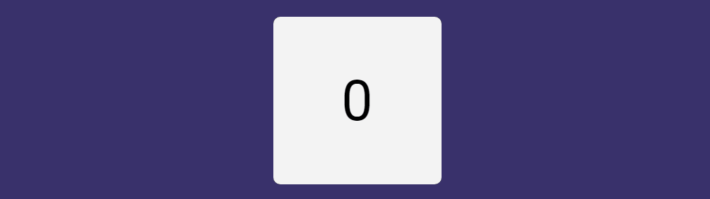
일반적으로 특정 요소에 손으로 숫자를 추가하기 때문에 counter 속성은 간과하기 쉽습니다. 그러나 메뉴 항목이나 큰 문서 페이지에 대한 심층 중첩 할당을 수행하려는 경우에 유용합니다.
또한 블로그 게시물 제목에 대해 자동화된 카운터를 만들 수 있습니다. 예: 여러 도구에 대한 리뷰를 작성 중입니다. 그리고 무엇보다도 카운터는 개별적으로 스타일을 지정할 수 있어 더 많은 디자인 자유를 제공합니다.
그러나 이 데모에서는 counter 속성을 사용하여 자동화된 카운터 효과를 만드는 데 중점을 두고 있습니다. 그럼 어떻게 작동하는지 파헤쳐 봅시다. 이 예에서는 먼저 카운터 애니메이션을 포함할 컨테이너를 만듭니다. 원하는 대로 사용자 정의할 수 있습니다. 다음으로 애니메이션 구문을 포함하는 .count-numbers 클래스를 만듭니다. 이 경우에는 animation: count-numbers 10s linear infinite forwards; .
이를 분해하기 위해 애니메이션의 이름을 지정하고 지속 시간을 10초로 설정하고 애니메이션 방향 을 normal로 설정합니다. 10부터 다시 계산하는 것을 원하지 않기 때문입니다. 하지만 다음으로 설정할 수 있습니다. 카운터가 거꾸로 계산되기를 원할 경우에도 교체 하십시오.
계속해서 .count-numbers::before라는 새 클래스를 지정하여 카운터 이름을 지정합니다. 이 경우에는 content: counter(count); . 다음 단계는 @keyframes 를 통해 효과를 애니메이션화하기 위해 counter-name 을 사용하는 것이기 때문에 이것은 중요합니다.
마지막 단계는 렌더링할 애니메이션에 대한 사양을 작성하는 것입니다. 데모에서는 1에서 10까지 계산하므로 @keyframes 값을 0%에서 100%까지 10% 단위로 지정합니다. 각 증분에는 카운터 이름도 사용하는 카운터 증분 명령문이 포함되어 있습니다. counter-increment: count 0; .
따라서 0%에서 증분은 0으로 설정되고 10%에서는 카운터 효과를 투영하기 위해 1로 설정됩니다.
또한 content: counter(count); 내용에 대한 사양: counter(count, 상위 로마자); 그리고 무슨 일이 일어나는지보십시오!
HTML
<main class="counter-container"> <div class="counter-card count-numbers"></div> </main>CSS
.counter-container { display: grid; grid-gap: 2rem; grid-template-columns: repeat(auto-fill, minmax(15rem, 1fr)); margin: auto; max-width: 100%; padding: 2rem; } .counter-card { align-items: center; border-radius: 10px; display: flex; height: 15rem; justify-content: center; position: relative; width: 100%; } .count-numbers { animation: count-numbers 10s linear infinite forwards; background-color: #f3f3f3; counter-reset: count 0; } .count-numbers::before { color: #000; content: counter(count); font-size: 5rem; } @keyframes count-numbers { 0% { counter-increment: count 0; } 10% { counter-increment: count 1; } 20% { counter-increment: count 2; } 30% { counter-increment: count 3; } 40% { counter-increment: count 4; } 50% { counter-increment: count 5; } 60% { counter-increment: count 6; } 70% { counter-increment: count 7; } 80% { counter-increment: count 8; } 90% { counter-increment: count 9; } 100% { counter-increment: count 10; } }튀는 공
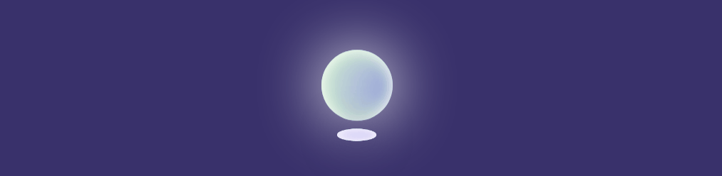
먼저 볼에 대한 컨테이너를 만드는 것으로 시작합니다. 이 경우에는 .ball-container 입니다.

다음으로 배경색과 그림자 효과를 조합하여 공의 크기와 모양을 지정합니다. 데모에서는 더 빛나는 효과를 사용했지만 필요에 따라 수정할 수 있습니다. 마지막으로 애니메이션을 지정합니다. 이 경우 지속 시간을 5초로 설정하고 전환이 느린 시작과 끝을 모두 갖는 easy ease-in-out 을 적용합니다.
공이 그려지고 애니메이션이 설정되면 @keyframes 규칙을 작성할 수 있습니다. 튀는 효과를 얻으려면 transform: translatey(); 를 사용합니다. 50%씩 증가하므로 0%에서 50%에서 100%입니다. 여기에서 transform: translatey(-50px); 를 지정하여 바운스 높이를 설정하기 때문에 강조점은 50%입니다. – 바운스/플로트는 높이가 50px입니다(컨테이너 기준). 음수가 높을수록 공이 더 높이 튀게 됩니다.
마찬가지로 더 작은 숫자를 지정하면 바운스 크기가 줄어듭니다.
마지막 부분은 그림자를 추가하는 것이지만 공 애니메이션 자체에는 영향을 미치지 않으므로 제거할 수도 있습니다. 그림자와의 유일한 차이점은 transform: scale() 속성을 사용하여 2D 컨텍스트에서 그림자의 크기를 조정한다는 것입니다. 달성하고자 하는 효과의 규모에 따라 값을 설정합니다.
HTML
<div class="ball-container"></div> <div class="ball-shadow"></div>CSS
.ball-container { margin: auto; animation: floating 5s ease-in-out infinite; height: 100px; width: 100px; border-radius: 50%; position: relative; background: radial-gradient(circle at 75% 30%, rgb(107, 6, 6) 5px, rgb(36, 187, 187) 8%, rgb(228, 26, 26) 60%, rgb(173, 221, 221) 100%); box-shadow: inset 0 0 20px #fff, inset 10px 0 46px #d3f8c8, inset 88px 0px 60px #b4c3dd, inset -20px -60px 100px #5b43e7, inset 0 50px 140px #6bdf7e, 0 0 90px #fff; } @keyframes floating { 0% { transform: translatey(0px); } 50% { transform: translatey(-50px); } 100% { transform: translatey(0px); } } .ball-shadow { width: 95px; height: 30px; top: 50%; animation: expanding 5s infinite; position: relative; border-radius: 50%; margin: auto; background: radial-gradient(circle at 75% 30%, rgb(221 215 243) 5px, rgb(36, 187, 187) 8%, rgb(228, 26, 26) 60%, rgb(173, 221, 221) 100%); box-shadow: inset 0 0 20px #fff, inset 10px 0 46px #3f51b500, inset 88px 0px 60px #ffffff99, inset -20px -60px 100px #5b43e791, inset 0 50px 140px #ffffff, 0 0 90px #39316b; } @keyframes expanding { 0%, 100% { transform: scale(0.5); } 50% { transform: scale(0.75); } }동전 던지기
이 애니메이션이 마음에 드는 점은 믿을 수 없을 정도로 정확한 회전 반경을 설정하여 동전이 실제로 튀는 것처럼 느껴지는 효과를 얻을 수 있다는 것입니다. 따라서 시작하려면 2개의 이미지가 필요합니다(이 데모에서는 SVG를 사용하고 있지만 일반 사진도 잘 작동합니다. 각 이미지에 올바른 클래스를 적용해야 합니다.)하고 opacity: 0; . 나중에 @keyframes 를 사용하여 불투명도를 변경하여 이미지가 애니메이션 중에 특정 위치에서 보기에 들어오도록 하기 때문에 0으로 설정했습니다.
.image-container 클래스는 동전 내부의 이미지 크기를 지정하는 데 사용됩니다. 아래 스니펫에 표시된 것처럼 실제 이미지에 대해서도 이를 지정해야 합니다. 다음으로 외부 부분(동전 자체)인 .coin-style 을 지정합니다. 기술적으로 투명하게 설정할 수 있지만 데모를 위해 표시하도록 합니다.
.coin-style 클래스의 주요 개념은 애니메이션을 추가하는 방식입니다. 이 경우에는 다음과 같습니다. animation: coin-flip 1.25s cube-bezier(0.93, 0.05, 0.9, 0.71) 무한 대체; .
관심 포인트는 cubic-bezier() 사양으로, 동전 컨테이너에 대한 회전 곡선 효과를 제공합니다. 이것은 실제로 직접 작성하는 것이 불가능하므로 원하는 곡선 효과를 렌더링하기 위해 생성 도구를 사용하는 것이 좋습니다.
마지막으로 @keyframes 내에서 scaleX() 함수를 적용하여 x-axis 기준으로 동전 모양의 크기를 조정합니다. (이 데모에서) 제공된 값에 대한 가장 최소한의 변경이라도 "뒤집기" 효과가 나타나는 방식을 수정합니다.
아래 구현은 완벽에 가깝지만 더 잘할 수 있다고 생각합니다!
HTML
<div class="coin-style"> <div class="image-container"> <svg class="firstimage" width="88" height="88" viewBox="0 0 32 32" data-name="Layer 1" id="Layer_1" xmlns="http://www.w3.org/2000/svg" xmlns:xlink="http://www.w3.org/1999/xlink"> <path class="cls-1" d="M23.5,2h-12a.47.47,0,0,0-.35.15l-5,5A.47.47,0,0,0,6,7.5v20A2.5,2.5,0,0,0,8.5,30h15A2.5,2.5,0,0,0,26,27.5V4.5A2.5,2.5,0,0,0,23.5,2Z" /> <path class="cls-2" d="M11.69,2a.47.47,0,0,0-.54.11l-5,5A.47.47,0,0,0,6,7.69.5.5,0,0,0,6.5,8h3A2.5,2.5,0,0,0,12,5.5v-3A.5.5,0,0,0,11.69,2Z" /> <path class="cls-3" d="M22.5,11a.5.5,0,0,0-.5.5v4.94l-.51-2.06a.52.52,0,0,0-1,0L20,16.44V11.5a.5.5,0,0,0-1,0v9a.51.51,0,0,0,.44.5.5.5,0,0,0,.55-.38l1-4.06,1,4.06a.5.5,0,0,0,.49.38h.06a.51.51,0,0,0,.44-.5v-9A.5.5,0,0,0,22.5,11Z" /> <path class="cls-3" d="M11.5,11h-2a.5.5,0,0,0-.5.5v9a.5.5,0,0,0,1,0V17h1.11l.9,3.62a.51.51,0,0,0,.49.38h.12a.51.51,0,0,0,.37-.61l-.88-3.51A1.51,1.51,0,0,0,13,15.5v-3A1.5,1.5,0,0,0,11.5,11Zm.5,4.5a.5.5,0,0,1-.5.5H10V12h1.5a.5.5,0,0,1,.5.5Z" /> <path class="cls-3" d="M16,11a.5.5,0,0,0-.49.42l-1.5,9a.49.49,0,0,0,.41.57.5.5,0,0,0,.57-.41L15.26,19h1.48L17,20.58a.49.49,0,0,0,.49.42h.08a.49.49,0,0,0,.41-.57l-1.5-9A.5.5,0,0,0,16,11Zm-.58,7L16,14.54,16.58,18Z" /> </svg> <svg class="secondimage" width="88" height="88" viewBox="0 0 32 32" data-name="Layer 1" id="Layer_1" xmlns="http://www.w3.org/2000/svg"> <defs> <style> .cls-1 { fill: #a08383; } .cls-2 { fill: #e1ebe9; } .cls-3 { fill: #770ba1; } .cls-4 { fill: #0a5097; } </style> </defs> <path class="cls-1" d="M23.5,2h-12a.47.47,0,0,0-.35.15l-5,5A.47.47,0,0,0,6,7.5v20A2.5,2.5,0,0,0,8.5,30h15A2.5,2.5,0,0,0,26,27.5V4.5A2.5,2.5,0,0,0,23.5,2Z" /> <path class="cls-2" d="M15,2h7a1,1,0,0,1,0,2H15a1,1,0,0,1,0-2Z" /> <path class="cls-2" d="M6,13.5v-2a1,1,0,0,1,2,0v2a1,1,0,0,1-2,0Z" /> <path class="cls-2" d="M6,24.5v-8a1,1,0,0,1,2,0v8a1,1,0,0,1-2,0Z" /> <path class="cls-4" d="M21.5,15.5h-1A.5.5,0,0,1,20,15V12.5a.5.5,0,0,1,.5-.5h2a.5.5,0,0,0,0-1h-2A1.5,1.5,0,0,0,19,12.5V15a1.5,1.5,0,0,0,1.5,1.5h1a.5.5,0,0,1,.5.5v2.5a.5.5,0,0,1-.5.5h-2a.5.5,0,0,0,0,1h2A1.5,1.5,0,0,0,23,19.5V17A1.5,1.5,0,0,0,21.5,15.5Z" /> <path class="cls-4" d="M15.5,12h2a.5.5,0,0,0,0-1h-2A1.5,1.5,0,0,0,14,12.5V15a1.5,1.5,0,0,0,1.5,1.5h1a.5.5,0,0,1,.5.5v2.5a.5.5,0,0,1-.5.5h-2a.5.5,0,0,0,0,1h2A1.5,1.5,0,0,0,18,19.5V17a1.5,1.5,0,0,0-1.5-1.5h-1A.5.5,0,0,1,15,15V12.5A.5.5,0,0,1,15.5,12Z" /> <path class="cls-4" d="M11,12a1,1,0,0,1,1,1,.5.5,0,0,0,1,0,2,2,0,0,0-4,0v6a2,2,0,0,0,4,0,.5.5,0,0,0-1,0,1,1,0,0,1-2,0V13A1,1,0,0,1,11,12Z" /> </svg> </div> </div>CSS
svg { color: #151516; position: absolute; } svg.firstimage { opacity: 0; animation: logo-flip 2.5s linear infinite alternate; } svg.secondimage { opacity: 0; animation: logo-flip 2.5s linear 2.5s infinite alternate; } .image-container { position: relative; height: 88px; width: 88px; } .coin-style { background: rgb(233, 226, 226); width: 136px; height: 136px; border-radius: 100%; margin: 0 auto; display: flex; justify-content: center; align-items: center; box-shadow: 0px 15px 15px -19px rgb(255, 255, 255); animation: coin-flip 1.25s cubic-bezier(0.93, 0.05, 0.9, 0.71) infinite alternate; } @keyframes coin-flip { 0% { transform: scaleX(0.95); } 100% { transform: scaleX(0.08); border-radius: 50%; } } @keyframes logo-flip { 0% { opacity: 0; } 50% { opacity: 0; } 53% { opacity: 1; } 100% { opacity: 1; } }슬라이드 인

이 애니메이션을 작동시키기 위해 우리는 animation: ease-out; @keyframes 내부의 음수 위치 값과 함께 함수를 사용합니다. 따라서 이 예에서는 0% {opacity: 0;left: -700px;} 를 지정하여 슬라이드인 요소를 처음에는 보이지 않게 하지만 컨테이너 외부에 700px 위치에 배치합니다.
그 후 100% {opacity: 1;left: 0;} 를 지정하면 애니메이션이 끝날 때까지(2초로 설정) 정상적인 가시성을 반환하고 요소를 다시 상대 위치로 배치합니다.
흥미로운 점은 이 효과가 모든 방향에서 작동한다는 것입니다.
슬라이드인 효과가 오른쪽에서 나타나도록 변경하려면 왼쪽 을 변경해야 합니다:; 오른쪽 값:; 상단 및 하단과 같은 위치의 경우 그 반대의 경우도 마찬가지입니다. 요소가 슬라이드인되는 데 걸리는 시간을 조정하여 애니메이션을 지연시킬 수도 있습니다.
값이 높을수록 애니메이션 속도가 느려집니다.
HTML
<h2 id="slide-in" class="animation"> Slide-In Animation </h2>CSS
.animation { position: relative; animation: animation 2s ease-out; } #slide-in { text-align: center; color: #fff; } @keyframes animation { 0% { opacity: 0; left: -700px; } 100% { opacity: 1; left: 0; } }얼룩 효과
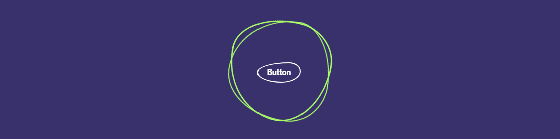
우선, Blob은 도대체 무엇입니까? Ian Latchmansingh가 말했듯이 “The Blob은 랜딩 페이지를 시각적으로 고정하는 데 일반적으로 사용되는 무정형의 유사 유기적 형태입니다. 일반적으로 일러스트레이션의 마스크나 배경으로 사용됩니다. 시간의 약 90%는 Blob이 그라디언트로 채워지고 디자인의 가장 낮은 레이어에 위치합니다." . 확실히 현대 웹 디자인에서 가장 일반적인 패턴 중 하나입니다. 그러나 어떻게 애니메이션을 적용합니까?
얼룩 효과 컨테이너를 만드는 것으로 시작하고 컨테이너 내부에 3개의 개별 스팬 요소도 지정합니다. 우리는 border와 border-radius 속성의 조합을 사용하여 실제로 블롭을 직접 "그리기" 때문에 이 작업을 수행합니다.
다양한 효과를 얻기 위해 nth-child 를 사용하여 각 요소의 스타일을 개별적으로 지정합니다. 펑키하게 만들고 싶다면 백분율 속성을 자유롭게 변경하여 얼룩 모양을 조정하십시오.
애니메이션 자체는 @keyframes 사양 내에서 transform: rotate() 속성을 사용하여 달성됩니다. 영구적인 효과를 주기 때문에 0~360도로 설정했습니다. 색상 오버레이는 :hover 를 통해 수행되며 사용자 정의 배경색을 설정할 수 있습니다. 또한 Blob 자체 내부에 별도의 컨테이너도 만듭니다. 이렇게 하면 특정 애니메이션 효과를 갖도록 페이지 레이아웃의 개별 부분에 스타일을 지정할 수 있습니다.
HTML
<div class="blob-effect"> <span></span> <span></span> <span></span> <div class="div-container"> <a href="#">Hover</a> </div> </div>CSS
.blob-effect { position: relative; width: 200px; height: 200px; display: flex; justify-content: center; align-items: center; } .blob-effect span:nth-child(1) { position: absolute; top: 0px; left: 0px; width: 100%; height: 100%; border: 2px solid #a9ff68; border-radius: 38% 62% 63% 37% / 41% 44% 56% 59%; transition: 0.5s; animation: rotate-blob 5s linear infinite; } .blob-effect:hover span:nth-child(1) { background: #d76bb1; border: none; } .blob-effect span:nth-child(2) { position: absolute; top: 0px; left: 0px; width: 100%; height: 100%; border: 2px solid #a9ff68; border-radius: 38% 62% 63% 37% / 41% 44% 56% 59%; transition: 0.5s; animation: rotate-blob 4s linear infinite; } .blob-effect:hover span:nth-child(2) { background: #f192d0; border: none; } .blob-effect span:nth-child(3) { position: absolute; top: 0px; left: 0px; width: 100%; height: 100%; border: 2px solid #a9ff68; border-radius: 38% 62% 63% 37% / 41% 44% 56% 59%; transition: 0.5s; animation: rotate-blob2 10s linear infinite; } .blob-effect:hover span:nth-child(3) { background: #f06ec294; border: none; } @keyframes rotate-blob { 0% { transform: rotate(0deg); } 100% { transform: rotate(360deg); } } @keyframes rotate-blob2 { 0% { transform: rotate(360deg); } 100% { transform: rotate(0deg); } } .div-container { position: relative; padding: 40px 60px; color: #fff; text-align: center; transition: 0.5s; z-index: 10000; } .div-container p { color: #fff; } .div-container a { position: relative; display: inline-block; margin-top: 10px; border: 2px solid #fff; padding: 6px 18px; text-decoration: none; color: #fff; font-weight: 600; border-radius: 73% 27% 44% 56% / 49% 44% 56% 51%; } .div-container a:hover { background: #fff; color: #333; }텍스트 전환
애니메이션 효과는 일반적으로 창의적인 웹 디자인을 위해 예약되어 있습니다. 이 경우 이 텍스트 전환 효과는 사이트 방문자에게 강한 첫인상을 주는 데 도움이 됩니다. 헤더 소개에 이상적이거나 사용자 정의된 경우 제품 기능 등을 보여주는 데 사용할 수 있습니다.
우리가 할 첫 번째 일은 실제 효과를 위한 컨테이너를 만드는 것입니다. 그런 다음 애니메이션 논리를 포함할 새 div 클래스를 지정합니다. 우리의 경우 3개의 개별 animation-delay 사양과 결합된 8초 애니메이션 길이를 사용합니다.
지연은 @keyframes 로직을 추가한 후 특정 단어가 언제 뷰에 나타날지 결정하는 데 사용됩니다.
HTML
<div class="g-container"> <div class="word">Text</div> <div class="word">Switch</div> <div class="word">Animation</div> </div>CSS
.g-container { position: relative; font-family: monospace; color: rgb(255, 255, 255); font-size: 4em; filter: contrast(15); } .word { position: absolute; top: 50%; left: 50%; transform: translate(-50%, -50%); animation: switch 8s infinite ease-in-out; min-width: 100%; margin: auto; } .word:nth-child(1) { animation-delay: -7s; } .word:nth-child(2) { animation-delay: -6s; } .word:nth-child(3) { animation-delay: -5s; } @keyframes switch { 0%, 5%, 100% { filter: blur(0px); opacity: 1; } 50%, 80% { filter: blur(180px); opacity: 0; } }호버 하이라이트
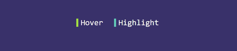
분명히, 이 특정 효과는 구체적인 애니메이션 속성을 사용하지 않습니다. 그러나 attr() 및 var() 함수의 사용은 이 효과를 시도하고 추가로 사용자 정의하기에 충분히 고무적이어야 합니다.
ul li a::before 사양을 보면 attr() 을 사용하여 효과를 부여하려는 요소를 지정합니다. 또한 호버 효과를 적용하려는 각 항목에 대한 사용자 정의 색상을 설정하는 데 사용하는 –clr 이라는 변수를 추가합니다.
이 예에서는 각 요소에 사용할 색상을 나타내기 위해 border-right 속성도 추가했습니다. 제거할 수 있으며 효과는 계속 작동합니다.
HTML
<ul> <li style="--clr:#a4e935"> <a href="#" hover-text=" Hover"> Hover </a> </li> <li style="--clr:#61cbb7"> <a href="#" hover-text=" Highlight"> Highlight </a> </li> </ul>CSS
ul { position: relative; display: flex; flex-direction: inherit; gap: 25px; } ul li { position: relative; list-style: none; } ul li a { font-size: 2em; font-family: monospace; text-decoration: none !important; letter-spacing: 0px; line-height: 1em; color: rgb(255, 255, 255); } ul li a::before { content: attr(hover-text); position: absolute; color: var(--clr); width: 0; overflow: hidden; transition: 1s; border-right: 8px solid var(--clr); -webkit-text-stroke: 1px var(--clr); } ul li a:hover::before { width: 100%; filter: drop-shadow(0 0 25px var(--clr)) }