
CSS 动画:介绍和示例
已发表: 2022-04-12 CSS中最基本的动画效果可以通过像transform和transition这样的属性来实现。 然而,CSS Animations Level 1 工作草案通过利用animation和@keyframes属性来实现永久动画效果,提供了一个更复杂的环境。 最好通过一个明确的例子来理解这一点。
使用@keyframes 指定动画规则
@keyframes规则用于指定我们希望应用于页面布局中的动画标识符的动画行为。 标识符通过animation-name或使用animation: name; 速记。
@keyframes change-color { from { background-color: #fff; } to { background-color: #000; } } 在这种情况下,上面的示例将在动画期间将background-color从白色更改为黑色。 from指的是开头 (0%), to指的是结尾 (100%)。 因此,规则也可以用百分比值重写。
@keyframes change-color { 0% { background-color: #fff; } 50% { background-color: #f3f3f3; } 100% { background-color: #000; } } 就其本身而言,除非我们指定要设置动画的元素,否则它不会做任何事情。 此外,您还必须指定animation-duration ,因为默认值为 0。
.container { width: 100vh; height: 100vh; animation-name: change-color; animation-duration: 5s; /* we can also rewrite this using a shorthand animation: change-color 5s; */ }然后我们可以使用 div 调用我们的容器,结果将是这样的:

通常,大多数用纯 CSS 编写的 CSS 动画都使用速记,因为它省去了编写多行动画逻辑的时间。 因此,这里是animation属性值的参考:
animation-name: name; /* the name of the specific animation (to animate with @keyframes) */ animation-duration: 10s; /* the duration */ animation-timing-function: linear; /* the veolcity curve for the animation */ animation-delay: 1s; /* set a delay for the animation playback */ animation-iteration-count: infinite; /* set it to an infinite loop */ animation-direction: alternate; /* back and forth, use normal for default direction */ animation-fill-mode: both; /* direction to apply the style */ animation-play-state: paused; /* also accepts 'running' */进一步阅读
如果你想深入了解 CSS 动画,这里是我推荐的资源:
- Codrops CSS 参考 - 这是由 Sara Soueidan (@SaraSoueidan) 编写和组织的广泛参考,包含有关某些 CSS 属性如何工作的深入示例。
- MDN CSS Animations – MDN Web Docs 页面上对 CSS 动画的广泛文档式介绍。
- 三次贝塞尔() 简介——Temani Afif (@ChallengesCss) 为 CSS-Tricks 撰写的一篇深度文章,介绍了使用
cubic-bezier()属性创建高级 CSS 动画。
CSS 动画示例
学习任何东西的最好方法是通过例子。 以下部分完全致力于通过 CSS 动画属性实现的各种效果。
最后一件事! 下面的许多示例动画都有很多与之相关的代码,因此,我在本文中添加了最大高度溢出以启用滚动条。 您还可以将鼠标悬停在每个代码片段上并将其复制到剪贴板以导入您的代码编辑器。
海浪

波浪动画是通过首先为波浪图案绘制 SVG 路径然后为其分配 ID 来创建的。 之后,我们使用自定义animation-delay和animation-duration变量指定四个nth-child类。 每个变量代表动画中的一个单独的波浪,每个波浪都可以独立设置样式。
使用 SVG 定义模式的优点是代码变得易于重用。
如果您查看我们绘制的路径,我们会为波浪指定四个不同的层(使用自定义轴),然后引用我们为初始路径设置的#wave-pattern id。 您还可以在此处更改每个波浪的颜色外观。
HTML
<div class="your-container"> <svg class="css-waves" xmlns="http://www.w3.org/2000/svg" xmlns:xlink="http://www.w3.org/1999/xlink" viewBox="0 24 150 28" preserveAspectRatio="none" shape-rendering="auto" > <defs> <path id="wave-pattern" d="M-160 44c30 0 58-18 88-18s 58 18 88 18 58-18 88-18 58 18 88 18 v44h-352z" ></path> </defs> <g class="animated-waves"> <use href="#wave-pattern" x="48" y="0" fill="rgba(155,255,255,0.7"></use> <use href="#wave-pattern" x="48" y="3" fill="rgba(155,255,255,0.5)"></use> <use href="#wave-pattern" x="48" y="5" fill="rgba(155,255,255,0.3)"></use> <use href="#wave-pattern" x="48" y="7" fill="rgba(155,255,255,0.3)"></use> </g> </svg> </div>CSS
.css-waves { position: relative; width: 100%; height: 15vh; margin-bottom: -7px; min-height: 100px; max-height: 150px; } /* Here we declare the SVG node that we wish to animate. */ .animated-waves > use { animation: infinite-waves 25s cubic-bezier(0.55, 0.5, 0.45, 0.5) infinite; } .animated-waves > use:nth-child(1) { animation-delay: -2s; animation-duration: 7s; } .animated-waves > use:nth-child(2) { animation-delay: -3s; animation-duration: 10s; } .animated-waves > use:nth-child(3) { animation-delay: -4s; animation-duration: 13s; } .animated-waves > use:nth-child(4) { animation-delay: -5s; animation-duration: 20s; } @keyframes infinite-waves { 0% { transform: translate3d(-90px, 0, 0); } 100% { transform: translate3d(85px, 0, 0); } } /* Mobile Optimization */ @media (max-width: 768px) { .css-waves { height: 40px; min-height: 40px; } }加载文本
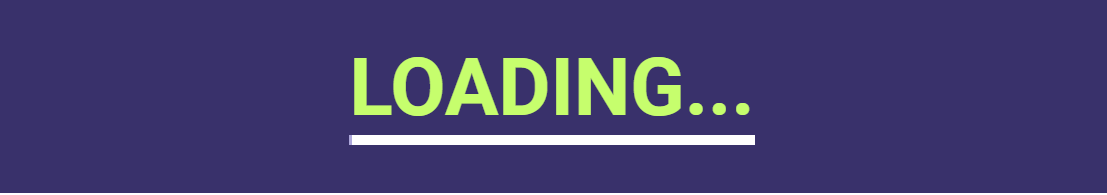
这种加载效果相对容易实现,因为它只使用了少数实用的动画属性。 首先,您要指定content: attr()值,然后将其应用于要设置动画的文本元素。 之后,您指定动画本身,在我们的例子中是animation: loading 5s linear infinite; .
可以通过更改 5s 属性来修改加载效果的持续时间。 最后,我们使用@keyframes调用加载动画,并在 5 秒内将其宽度从 0% 更改为 100%。 动画持续时间值越高,加载效果越慢。
像这样的动画的特定用例是页面加载的过渡效果,但当您不想依赖任何库时,它也是应用程序项目的可靠解决方案。
HTML
<!-- the loading-text class is specified through the content: attr(); property. change the value name to implement multiple design variations, or reuse the same class to show the loading effect in other parts of your design --> <h2 loading-text="Loading...">Loading...</h1>CSS
h2 { position: relative; font-size: 5em; color: rgb(199, 255, 110); text-transform: uppercase; border-bottom: 10px solid #ffffff; line-height: initial; } h2::before { content: attr(loading-text); position: absolute; top: 0; left: 0; width: 100%; color: #b0a8e2; overflow: hidden; border-bottom: 10px solid #b0a8e2; animation: loading 5s linear infinite; } @keyframes loading { 0% { width: 0; } 100% { width: 100%; } }文字波
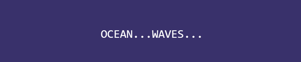
关于此动画,您首先会注意到的一件事是它的流动性。 这是可能的,因为我们使用calc()函数以数学方式计算每个转换。 由于我们用纯 CSS 编写动画,我们必须使用多个span元素来指定动画中的每个连续字母。
至于修改波浪的深度,首先,您可以将持续时间从 3 秒更改为更小或更大的数字。 更高意味着波浪效应会更慢,反之亦然。 并且,在@keyframes中,您可以更改 -24px 规范以更改波浪的高度。
负值越高,波浪效应越明显。
HTML
<div class="blwb"> <span style="--i:1">O</span> <span style="--i:2">C</span> <span style="--i:3">E</span> <span style="--i:4">A</span> <span style="--i:5">N</span> <span style="--i:6">.</span> <span style="--i:7">.</span> <span style="--i:8">.</span> <span style="--i:9">W</span> <span style="--i:10">A</span> <span style="--i:11">V</span> <span style="--i:12">E</span> <span style="--i:13">S</span> <span style="--i:14">.</span> <span style="--i:15">.</span> <span style="--i:16">.</span> </div>CSS
.text-wave { margin: auto; display: flex; align-items: center; justify-content: center; position: relative; } .text-wave span { position: relative; color: rgb(255, 255, 255); font-size: 40px; font-family: monospace; animation: wave 3s ease-in-out infinite; animation-delay: calc(.1s*var(--i)); } @keyframes wave { 0% { transform: translateY(0px); } 20% { transform: translateY(-24px); } 40%, 100% { transform: translateY(0); } }脉冲/纹波效应
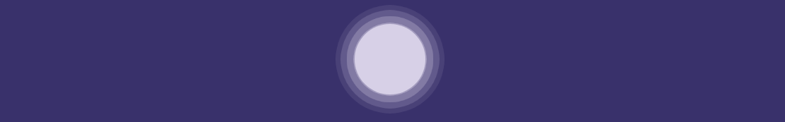
我们首先为要应用效果的圆圈创建一个容器。 这是特定于演示的,但您可以将代码重用于页面上的任何其他元素。 之后,我们创建一个名为.circle的类,它将作为动画波纹效果。
我们在这个类中使用的两个值得注意的属性是opacity: 0.5; 和animation: ease-out; . 不透明度是产生涟漪/脉冲错觉的原因,缓出过渡使这些涟漪从原始容器中缓和出来。
接下来,我们采用.circle类并将nth-of-type()属性应用于它。 对于这个例子,我们使用了 3 个独立的圆圈,它们从原始容器中缓和出来。 在 nth-of-type 调用中,我们使用值为 -0.5s;-1s;-1.5s 的animation-delay 。 负值越高,效果完全渲染所需的时间就越长。
最后,我们将@keyframes 应用于我们指定的脉冲动画。 在这个例子中,我们使用了transform: scale()属性。 这定义了每个动画的脉冲大小。 值越高,输出的涟漪就越大。
HTML
<div class="pulse-effect"> <div class="circle"></div> <div class="circle"></div> <div class="circle"></div> <div class="circle"></div> </div>CSS
.pulse-effect { background-color: #f6efffa1; height: 100px; width: 100px; border-radius: 100%; position: relative; margin: auto; } .circle { position: absolute; background-color: inherit; height: 100%; width: 100%; border-radius: 100%; opacity: 0.5; animation: pulse 3s ease-out infinite; } .circle:nth-of-type(1) { animation-delay: -0.5s; } .circle:nth-of-type(2) { animation-delay: -1s; } .circle:nth-of-type(3) { animation-delay: -1.5s; } @keyframes pulse { 100% { transform: scale(1.75); opacity: 0; } }计数器(数字)
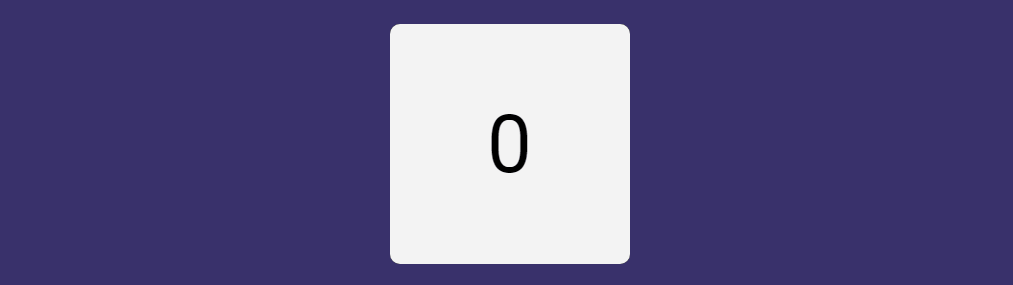
counter 属性很容易被忽略,因为通常您手动将数字添加到某些元素。 但是,当您想要对菜单项或大型文档页面进行深入的嵌套分配时,它会派上用场。
此外,您可以为博客文章标题组合一个自动计数器。 例如,您正在撰写关于多种工具的评论。 而且,最重要的是,柜台可以单独设计,给您更多的设计自由。
但是,对于这个演示 - 我们专注于使用counter属性来创建自动计数器效果。 所以,让我们深入了解它是如何工作的。 对于这个例子,我们首先创建一个包含计数器动画的容器。 您可以根据需要自定义它。 接下来,我们创建包含动画语法的.count-numbers类,在本例中,它是animation: count-numbers 10s linear infinite forwards; .
为了分解它,我们指定动画的名称,将持续时间设置为 10 秒,并将动画方向设置为正常,因为我们不希望它从 10 开始倒数。不过,您可以将其设置为如果你希望你的计数器倒数,也可以交替使用。
继续,我们指定一个名为 .count-numbers::before 的新类,我们用它来命名我们的计数器,在本例中为content: counter(count); . 这很重要,因为下一步是使用counter-name通过@keyframes为效果设置动画。
最后一步是为要渲染的动画编写规范。 在我们的演示中,我们从 1 计数到 10,因此我们以 10% 的增量将 @keyframes 值指定为从 0% 到 100%。 每个增量都包含一个计数器增量语句,该语句也使用我们的计数器名称: counter-increment: count 0; .
因此,在 0% 时,我们的增量设置为 0,在 10% 时设置为 1,以投射计数器的效果。
另外,尝试更改content: counter(count); 内容规范:counter(count, upper-roman); 看看会发生什么!
HTML
<main class="counter-container"> <div class="counter-card count-numbers"></div> </main>CSS
.counter-container { display: grid; grid-gap: 2rem; grid-template-columns: repeat(auto-fill, minmax(15rem, 1fr)); margin: auto; max-width: 100%; padding: 2rem; } .counter-card { align-items: center; border-radius: 10px; display: flex; height: 15rem; justify-content: center; position: relative; width: 100%; } .count-numbers { animation: count-numbers 10s linear infinite forwards; background-color: #f3f3f3; counter-reset: count 0; } .count-numbers::before { color: #000; content: counter(count); font-size: 5rem; } @keyframes count-numbers { 0% { counter-increment: count 0; } 10% { counter-increment: count 1; } 20% { counter-increment: count 2; } 30% { counter-increment: count 3; } 40% { counter-increment: count 4; } 50% { counter-increment: count 5; } 60% { counter-increment: count 6; } 70% { counter-increment: count 7; } 80% { counter-increment: count 8; } 90% { counter-increment: count 9; } 100% { counter-increment: count 10; } }弹跳球
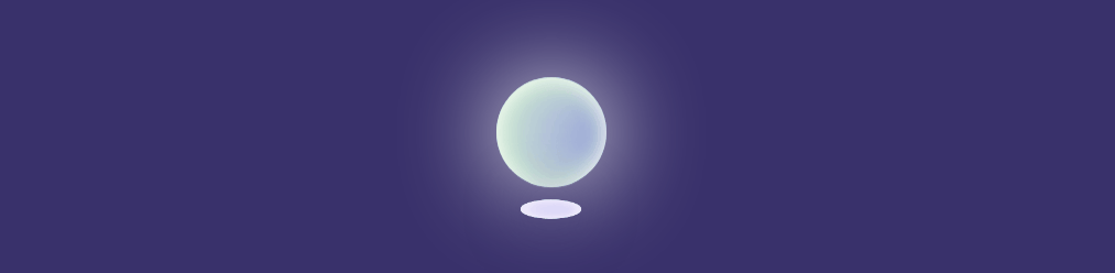
我们首先为我们的球创建一个容器,在本例中,它是.ball-container 。

接下来,我们使用背景颜色和阴影效果的组合来指定球的大小和外观样式。 在我们的演示中,我们采用了更加发光的效果,但您可以根据自己的需要进行修改。 最后,我们指定动画,在这种情况下,我们将持续时间设置为 5 秒并应用ease-in-out ,这意味着过渡既有缓慢的开始也有结束的。
画完球并设置好动画后,我们就可以编写我们的@keyframes规则了。 为了实现弹跳效果,我们使用transform: translatey(); 以 50% 为增量,因此从 0% 到 50% 到 100%。 重点是 50%,因为这里我们通过指定transform: translatey(-50px);来设置反弹的高度。 – 反弹/浮动高度为 50px(相对于容器)。 负数越高,球反弹的幅度就越大。
同样,指定较小的数字将减小反弹的大小。
最后一部分是添加阴影,尽管您也可以删除它,因为它对球动画本身没有影响。 与阴影的唯一区别是我们使用transform: scale()属性来调整 2D 上下文中的阴影大小。 我们根据希望实现的效果规模设置值。
HTML
<div class="ball-container"></div> <div class="ball-shadow"></div>CSS
.ball-container { margin: auto; animation: floating 5s ease-in-out infinite; height: 100px; width: 100px; border-radius: 50%; position: relative; background: radial-gradient(circle at 75% 30%, rgb(107, 6, 6) 5px, rgb(36, 187, 187) 8%, rgb(228, 26, 26) 60%, rgb(173, 221, 221) 100%); box-shadow: inset 0 0 20px #fff, inset 10px 0 46px #d3f8c8, inset 88px 0px 60px #b4c3dd, inset -20px -60px 100px #5b43e7, inset 0 50px 140px #6bdf7e, 0 0 90px #fff; } @keyframes floating { 0% { transform: translatey(0px); } 50% { transform: translatey(-50px); } 100% { transform: translatey(0px); } } .ball-shadow { width: 95px; height: 30px; top: 50%; animation: expanding 5s infinite; position: relative; border-radius: 50%; margin: auto; background: radial-gradient(circle at 75% 30%, rgb(221 215 243) 5px, rgb(36, 187, 187) 8%, rgb(228, 26, 26) 60%, rgb(173, 221, 221) 100%); box-shadow: inset 0 0 20px #fff, inset 10px 0 46px #3f51b500, inset 88px 0px 60px #ffffff99, inset -20px -60px 100px #5b43e791, inset 0 50px 140px #ffffff, 0 0 90px #39316b; } @keyframes expanding { 0%, 100% { transform: scale(0.5); } 50% { transform: scale(0.75); } }硬币翻转
我喜欢这个动画的地方在于,我们可以设置一个非常精确的旋转半径来实现感觉就像硬币真的在翻转的效果。 所以,开始你需要 2 张图片(我在这个演示中使用 SVG,但普通照片也可以正常工作。只需确保对每张图片应用正确的类。)并将它们设置为opacity: 0; . 我们将其设置为 0,因为稍后,我们使用@keyframes来更改它们的不透明度,以便图像在动画期间的特定位置进入视图。
.image-container类用于指定硬币内图像的尺寸。 确保您还为实际图像指定了此项,如下面的代码片段所示。 接下来,我们指定.coin-style是外部部分(硬币本身)。 从技术上讲,您可以将其设置为透明,但为了演示,我们将其设为可见。
.coin-style类的主要概念是我们添加动画的方式,在这个例子中是:动画:coin-flip 1.25scubic-bezier(0.93, 0.05, 0.9, 0.71) 无限交替; .
兴趣点是cubic-bezier()规范,它为我们提供了硬币容器的旋转曲线效果。 这实际上是不可能自己编写的,所以我的建议是使用任何生成器工具来渲染所需的曲线效果。
最后,在我们的@keyframes中,我们应用scaleX()函数在x-axis基础上调整硬币外观的大小。 即使对提供的值(在此演示中)进行最小的更改也会改变“翻转”效果的出现方式。
我认为下面的实现已经接近完美,但也许你可以做得更好!
HTML
<div class="coin-style"> <div class="image-container"> <svg class="firstimage" width="88" height="88" viewBox="0 0 32 32" data-name="Layer 1" id="Layer_1" xmlns="http://www.w3.org/2000/svg" xmlns:xlink="http://www.w3.org/1999/xlink"> <path class="cls-1" d="M23.5,2h-12a.47.47,0,0,0-.35.15l-5,5A.47.47,0,0,0,6,7.5v20A2.5,2.5,0,0,0,8.5,30h15A2.5,2.5,0,0,0,26,27.5V4.5A2.5,2.5,0,0,0,23.5,2Z" /> <path class="cls-2" d="M11.69,2a.47.47,0,0,0-.54.11l-5,5A.47.47,0,0,0,6,7.69.5.5,0,0,0,6.5,8h3A2.5,2.5,0,0,0,12,5.5v-3A.5.5,0,0,0,11.69,2Z" /> <path class="cls-3" d="M22.5,11a.5.5,0,0,0-.5.5v4.94l-.51-2.06a.52.52,0,0,0-1,0L20,16.44V11.5a.5.5,0,0,0-1,0v9a.51.51,0,0,0,.44.5.5.5,0,0,0,.55-.38l1-4.06,1,4.06a.5.5,0,0,0,.49.38h.06a.51.51,0,0,0,.44-.5v-9A.5.5,0,0,0,22.5,11Z" /> <path class="cls-3" d="M11.5,11h-2a.5.5,0,0,0-.5.5v9a.5.5,0,0,0,1,0V17h1.11l.9,3.62a.51.51,0,0,0,.49.38h.12a.51.51,0,0,0,.37-.61l-.88-3.51A1.51,1.51,0,0,0,13,15.5v-3A1.5,1.5,0,0,0,11.5,11Zm.5,4.5a.5.5,0,0,1-.5.5H10V12h1.5a.5.5,0,0,1,.5.5Z" /> <path class="cls-3" d="M16,11a.5.5,0,0,0-.49.42l-1.5,9a.49.49,0,0,0,.41.57.5.5,0,0,0,.57-.41L15.26,19h1.48L17,20.58a.49.49,0,0,0,.49.42h.08a.49.49,0,0,0,.41-.57l-1.5-9A.5.5,0,0,0,16,11Zm-.58,7L16,14.54,16.58,18Z" /> </svg> <svg class="secondimage" width="88" height="88" viewBox="0 0 32 32" data-name="Layer 1" id="Layer_1" xmlns="http://www.w3.org/2000/svg"> <defs> <style> .cls-1 { fill: #a08383; } .cls-2 { fill: #e1ebe9; } .cls-3 { fill: #770ba1; } .cls-4 { fill: #0a5097; } </style> </defs> <path class="cls-1" d="M23.5,2h-12a.47.47,0,0,0-.35.15l-5,5A.47.47,0,0,0,6,7.5v20A2.5,2.5,0,0,0,8.5,30h15A2.5,2.5,0,0,0,26,27.5V4.5A2.5,2.5,0,0,0,23.5,2Z" /> <path class="cls-2" d="M15,2h7a1,1,0,0,1,0,2H15a1,1,0,0,1,0-2Z" /> <path class="cls-2" d="M6,13.5v-2a1,1,0,0,1,2,0v2a1,1,0,0,1-2,0Z" /> <path class="cls-2" d="M6,24.5v-8a1,1,0,0,1,2,0v8a1,1,0,0,1-2,0Z" /> <path class="cls-4" d="M21.5,15.5h-1A.5.5,0,0,1,20,15V12.5a.5.5,0,0,1,.5-.5h2a.5.5,0,0,0,0-1h-2A1.5,1.5,0,0,0,19,12.5V15a1.5,1.5,0,0,0,1.5,1.5h1a.5.5,0,0,1,.5.5v2.5a.5.5,0,0,1-.5.5h-2a.5.5,0,0,0,0,1h2A1.5,1.5,0,0,0,23,19.5V17A1.5,1.5,0,0,0,21.5,15.5Z" /> <path class="cls-4" d="M15.5,12h2a.5.5,0,0,0,0-1h-2A1.5,1.5,0,0,0,14,12.5V15a1.5,1.5,0,0,0,1.5,1.5h1a.5.5,0,0,1,.5.5v2.5a.5.5,0,0,1-.5.5h-2a.5.5,0,0,0,0,1h2A1.5,1.5,0,0,0,18,19.5V17a1.5,1.5,0,0,0-1.5-1.5h-1A.5.5,0,0,1,15,15V12.5A.5.5,0,0,1,15.5,12Z" /> <path class="cls-4" d="M11,12a1,1,0,0,1,1,1,.5.5,0,0,0,1,0,2,2,0,0,0-4,0v6a2,2,0,0,0,4,0,.5.5,0,0,0-1,0,1,1,0,0,1-2,0V13A1,1,0,0,1,11,12Z" /> </svg> </div> </div>CSS
svg { color: #151516; position: absolute; } svg.firstimage { opacity: 0; animation: logo-flip 2.5s linear infinite alternate; } svg.secondimage { opacity: 0; animation: logo-flip 2.5s linear 2.5s infinite alternate; } .image-container { position: relative; height: 88px; width: 88px; } .coin-style { background: rgb(233, 226, 226); width: 136px; height: 136px; border-radius: 100%; margin: 0 auto; display: flex; justify-content: center; align-items: center; box-shadow: 0px 15px 15px -19px rgb(255, 255, 255); animation: coin-flip 1.25s cubic-bezier(0.93, 0.05, 0.9, 0.71) infinite alternate; } @keyframes coin-flip { 0% { transform: scaleX(0.95); } 100% { transform: scaleX(0.08); border-radius: 50%; } } @keyframes logo-flip { 0% { opacity: 0; } 50% { opacity: 0; } 53% { opacity: 1; } 100% { opacity: 1; } }滑入式

为了使这个动画工作,我们使用animation: ease-out; 函数与@keyframes内的负位置值结合使用。 所以,在这个例子中,我们指定0% {opacity: 0;left: -700px;}这使得我们的滑入元素在开始时不可见,但也位于容器外 700px 处。
之后,我们指定100% {opacity: 1;left: 0;} ,当我们的动画结束时(我们将其设置为 2 秒)将返回正常可见性,并将我们的元素定位回其相对位置。
需要注意的一个有趣的事情是,这种效果在各个方向都有效。
如果要更改滑入效果从右侧出现,则需要更改左侧:; 正确的值:; 对于顶部和底部等位置,反之亦然。 您还可以通过调整元素滑入所需的时间来延迟动画。
较高的值会减慢动画速度。
HTML
<h2 id="slide-in" class="animation"> Slide-In Animation </h2>CSS
.animation { position: relative; animation: animation 2s ease-out; } #slide-in { text-align: center; color: #fff; } @keyframes animation { 0% { opacity: 0; left: -700px; } 100% { opacity: 1; left: 0; } }斑点效应
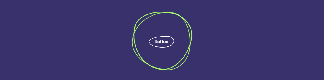
首先,Blob 到底是什么? 正如 Ian Latchmansingh 所说, “Blob 是一种无定形的伪有机形状,通常用于在视觉上锚定着陆页。 它通常用作插图的面具或背景。 大约 90% 的时间,Blob 被渐变填充并位于设计的最低层。” . 它当然是现代网页设计中更常见的模式之一。 但是,我们如何制作动画呢?
我们首先创建一个 blob-effect 容器,并在容器内指定 3 个单独的 span 元素。 我们这样做是因为我们实际上使用了border 和border-radius 属性的组合自己“绘制”了blob。
为了达到不同的效果,我们使用nth-child来单独设置每个元素的样式。 如果您想使用它变得时髦,请随意更改百分比属性以调整 blob 外观。
动画本身是通过使用@keyframes规范中的transform: rotate()属性来实现的。 我们将其设置为 0 到 360 度,因为这给了我们永久的效果。 颜色叠加是通过:hover完成的,让我们设置自定义背景颜色。 此外,我们还在 blob 内部创建了一个单独的容器。 这使您能够对页面布局的各个部分进行样式设置,以获得这种特定的动画效果。
HTML
<div class="blob-effect"> <span></span> <span></span> <span></span> <div class="div-container"> <a href="#">Hover</a> </div> </div>CSS
.blob-effect { position: relative; width: 200px; height: 200px; display: flex; justify-content: center; align-items: center; } .blob-effect span:nth-child(1) { position: absolute; top: 0px; left: 0px; width: 100%; height: 100%; border: 2px solid #a9ff68; border-radius: 38% 62% 63% 37% / 41% 44% 56% 59%; transition: 0.5s; animation: rotate-blob 5s linear infinite; } .blob-effect:hover span:nth-child(1) { background: #d76bb1; border: none; } .blob-effect span:nth-child(2) { position: absolute; top: 0px; left: 0px; width: 100%; height: 100%; border: 2px solid #a9ff68; border-radius: 38% 62% 63% 37% / 41% 44% 56% 59%; transition: 0.5s; animation: rotate-blob 4s linear infinite; } .blob-effect:hover span:nth-child(2) { background: #f192d0; border: none; } .blob-effect span:nth-child(3) { position: absolute; top: 0px; left: 0px; width: 100%; height: 100%; border: 2px solid #a9ff68; border-radius: 38% 62% 63% 37% / 41% 44% 56% 59%; transition: 0.5s; animation: rotate-blob2 10s linear infinite; } .blob-effect:hover span:nth-child(3) { background: #f06ec294; border: none; } @keyframes rotate-blob { 0% { transform: rotate(0deg); } 100% { transform: rotate(360deg); } } @keyframes rotate-blob2 { 0% { transform: rotate(360deg); } 100% { transform: rotate(0deg); } } .div-container { position: relative; padding: 40px 60px; color: #fff; text-align: center; transition: 0.5s; z-index: 10000; } .div-container p { color: #fff; } .div-container a { position: relative; display: inline-block; margin-top: 10px; border: 2px solid #fff; padding: 6px 18px; text-decoration: none; color: #fff; font-weight: 600; border-radius: 73% 27% 44% 56% / 49% 44% 56% 51%; } .div-container a:hover { background: #fff; color: #333; }文字切换
动画效果通常保留给创意网页设计。 在这种情况下,这种文本切换效果将有助于为您的网站访问者创造强烈的第一印象。 非常适合标题介绍,或者如果定制 - 可用于展示产品功能等。
我们要做的第一件事是为实际效果创建一个容器。 之后,我们指定一个包含动画逻辑的新 div 类。 在我们的例子中,我们使用 8 秒的动画长度,结合 3 个独立animation-delay规范。
在我们添加@keyframes逻辑后,延迟用于确定特定单词何时进入视图。
HTML
<div class="g-container"> <div class="word">Text</div> <div class="word">Switch</div> <div class="word">Animation</div> </div>CSS
.g-container { position: relative; font-family: monospace; color: rgb(255, 255, 255); font-size: 4em; filter: contrast(15); } .word { position: absolute; top: 50%; left: 50%; transform: translate(-50%, -50%); animation: switch 8s infinite ease-in-out; min-width: 100%; margin: auto; } .word:nth-child(1) { animation-delay: -7s; } .word:nth-child(2) { animation-delay: -6s; } .word:nth-child(3) { animation-delay: -5s; } @keyframes switch { 0%, 5%, 100% { filter: blur(0px); opacity: 1; } 50%, 80% { filter: blur(180px); opacity: 0; } }悬停高亮
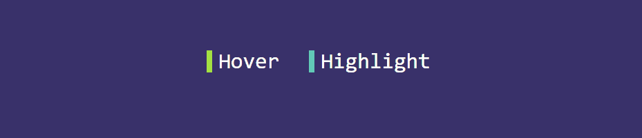
诚然,这个特定的效果不使用具体的动画属性。 但是, attr()和var()函数的使用应该足够鼓舞人心,可以尝试进一步定制这种效果。
如果您查看ul li a::before规范 - 我们使用attr()来指定我们希望将效果归因于哪个元素。 此外,我们添加了一个名为–clr的变量,您可以使用它为您希望应用悬停效果的每个项目设置自定义颜色。
对于这个例子,我们还添加了border-right属性来指示我们为每个元素使用的颜色。 您可以删除它,效果仍然有效。
HTML
<ul> <li style="--clr:#a4e935"> <a href="#" hover-text=" Hover"> Hover </a> </li> <li style="--clr:#61cbb7"> <a href="#" hover-text=" Highlight"> Highlight </a> </li> </ul>CSS
ul { position: relative; display: flex; flex-direction: inherit; gap: 25px; } ul li { position: relative; list-style: none; } ul li a { font-size: 2em; font-family: monospace; text-decoration: none !important; letter-spacing: 0px; line-height: 1em; color: rgb(255, 255, 255); } ul li a::before { content: attr(hover-text); position: absolute; color: var(--clr); width: 0; overflow: hidden; transition: 1s; border-right: 8px solid var(--clr); -webkit-text-stroke: 1px var(--clr); } ul li a:hover::before { width: 100%; filter: drop-shadow(0 0 25px var(--clr)) }