
前端開發人員的 10 個有用的 CSS 技巧
已發表: 2022-03-08- 用 CSS 破解 WordPress
- 如何使用這些 CSS 技巧
- 文字的打字效果
- 透明圖像的陰影
- 設置自定義光標
- 使用 attr() 的簡單工具提示
- 純 CSS 中的清單
- 使用 :is() 和 :where() 樣式化元素
- 使用關鍵幀的手風琴下拉菜單
- 懸停效果側邊欄
- 使用首字母的首字母大寫
- 使用 ::before 在按鈕前添加圖標
CSS 現在處於相當好的狀態。 引入的新特性有助於鞏固 CSS 作為真正的腳本語言。 我們知道已經制定了一份提案草案來引入@when和@else語句。 雖然現在不可用,但它確實為未來使用 CSS 編寫條件邏輯的潛力開創了先例。
Michelle Barker 為 Smashing Magazine 寫了一篇文章,討論了即將到來的 CSS 特性。 如果您還沒有時間趕上,請檢查一下!
根據我的經驗,除非您經常檢查更新,否則很容易忽略現有功能。 is()和where()以及attr()等屬性已經存在了一段時間,但很容易被現代框架的潛力所掩蓋。
用 CSS 破解 WordPress
我對這篇文章的靈感直接來自我每天使用 WordPress 的經驗。 我已經使用 WordPress 超過 10 年了。 而那段時間,我一定寫了10000+行CSS來定制各種主題設計。
但是,更具體地說,我使用 CSS 來克服對插件的需求。 WordPress 的工作方式是幾乎所有東西都需要使用插件。 當然,除非你懂一點 CSS。 想要顯示工具提示? 獲取插件。 想要為按鈕添加圖標? 獲取插件。
你明白了。
如何使用這些 CSS 技巧
唯一的要求是您了解一點 CSS 和 HTML。 我提供了示例模板,您可以將其直接導入到您的項目中。
您可以使用此模板並將其另存為index.html :
<!DOCTYPE HTML> <html> <head> <title>CSS Tricks & Tips</title> <meta charset="UTF-8" /> <style> <!-- put the CSS code here --> </style> </head> <body> <!-- put the HTML code here --> </body> </html>文字的打字效果
網頁設計每分鐘都變得越來越有創意。 在 CSS 動畫功能的幫助下,您可以讓您的網頁充滿活力。 在本例中,我們使用animation和@keyframes屬性來實現打字機效果。
具體來說,對於這個演示,我們實現了steps()屬性來分割我們的文本動畫。 首先,您必須指定steps()的數量,在我們的例子中是我們希望動畫的文本的字符長度。
其次,我們使用@keyframes來聲明動畫何時開始。 例如,如果您在“Typing effect for text”之後寫了另一個詞,除非您更改 CSS 片段中的steps()數,否則動畫將不起作用。
也就是說,這種效果並不是特別新。 然而,儘管使用 CSS 可以實現相同的結果,但大多數開發人員都湧向 JavaScript 庫。
HTML
<div class="typing"> <div class="typing-effect"> Typing effect for text </div> </div>CSS
.typing { height: 80vh; display: flex; align-items: center; justify-content: center; } .typing-effect { width: 22ch; animation: typing 2s steps(22), effect .5s step-end infinite alternate; white-space: nowrap; overflow: hidden; border-right: 3px solid; font-family: monospace; font-size: 2em; } @keyframes typing { from { width: 0; } } @keyframes effect { 50% { border-color: transparent; } } 透明圖像的陰影
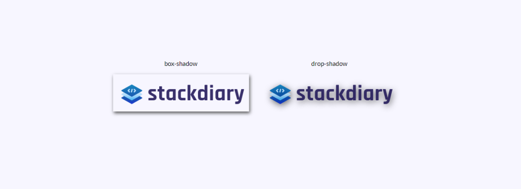
你有沒有嘗試過為透明圖像添加box-shadow只是為了讓它看起來像你添加了一個邊框? 我想我們都去過那裡。 為透明圖像添加陰影效果的解決方案是使用drop-shadow 。
它的工作方式是drop-shadow屬性遵循給定圖像的 Alpha 通道。 因此,陰影基於圖像內部的形狀,而不是顯示在圖像外部。
HTML
<div class="transparent-shadow"> <div class="margin-right"> <div class="margin-bottom align-center"> box-shadow </div> <img class="box-shadow" src="https://stackdiary.com/wp-content/uploads/2022/02/logo.png" alt="box-shadow example (transparent)"> </div> <div> <div class="margin-bottom align-center"> drop-shadow </div> <img class="drop-shadow" src="https://stackdiary.com/wp-content/uploads/2022/02/logo.png" alt="drop-shadow example (transparent)"> </div> </div>CSS
.transparent-shadow { height: 80vh; display: flex; align-items: center; justify-content: center; } .margin-right { margin-right: 2em; } .margin-bottom { margin-bottom: 1em; } .align-center { text-align: center; } .box-shadow { box-shadow: 2px 4px 8px #3723a1; } .drop-shadow { filter: drop-shadow(2px 4px 8px #3723a1); }設置自定義光標
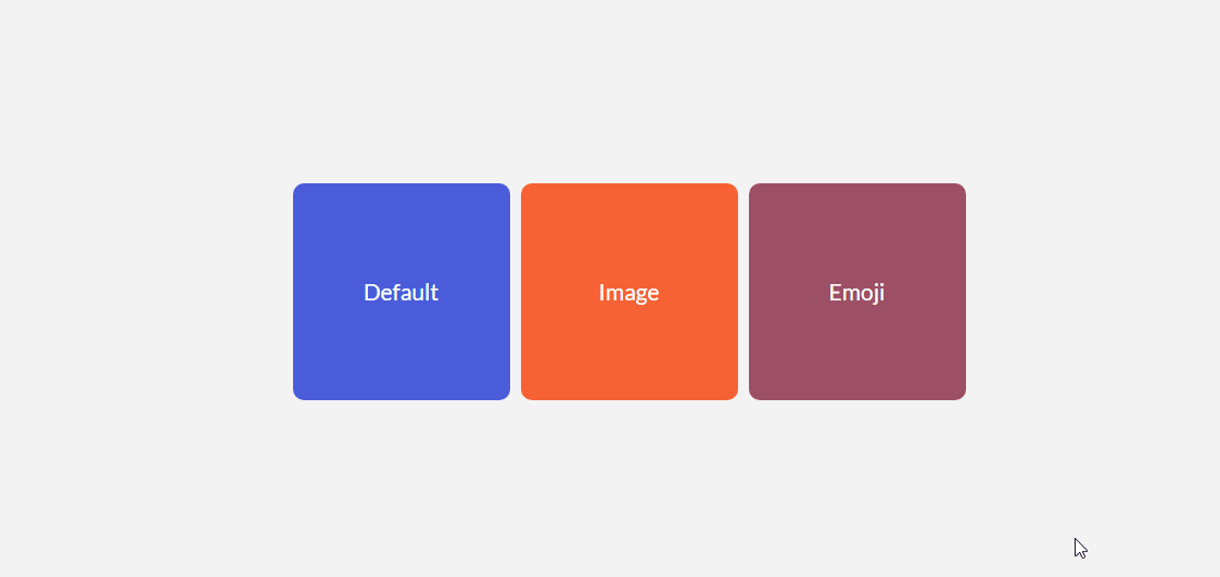
您不太可能需要強迫您的訪問者進入一個獨特的光標。 至少,不是出於一般用戶體驗目的。 不過,關於cursor屬性需要注意的一件事是它可以讓您顯示圖像。 這相當於以照片格式顯示工具提示。
一些用例包括能夠比較兩張不同的照片,而無需在視口中渲染這些照片。 例如,光標屬性可用於在您的設計中節省空間。 由於您可以將自定義光標鎖定到特定的 div 元素,因此它不會干擾它之外的元素。
HTML
<div class="custom-cursor"> <div class="card"> Default </div> <div class="card card-image-cursor"> Image </div> <div class="card card-emoji-cursor"> Emoji </div> </div>CSS
.custom-cursor { display: flex; height: 80vh; align-items: center; justify-content: center; background: #f3f3f3; padding: 0 10px; } .card { width: 200px; height: 200px;display: flex; align-items: center; justify-content: center; background-color: #D29A5A; margin-right: 10px;color: #fff; font-size: 1.4em; text-align: center; } .card-image-cursor { background-color: #D11A5A; cursor: url(https://stackdiary.com/tools/assets/img/tools/html-beautifier.svg), auto; } .card-emoji-cursor { background-color: #D29B22; cursor: url("data:image/svg+xml;utf8,<svg xmlns='http://www.w3.org/2000/svg' width='48' height='48' viewport='0 0 100 100' style='fill:black;font-size:24px;'><text y='50%'></text></svg>"), auto; }使用attr()的簡單工具提示
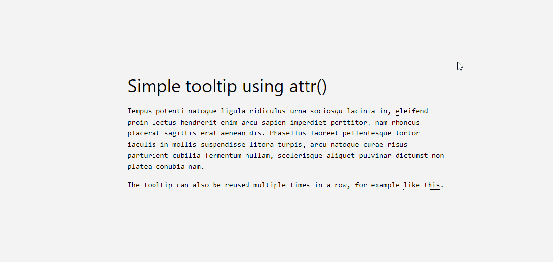
attr()屬性是我最近最喜歡的發現之一。 我想在我的 WordPress 博客中添加一個工具提示功能,但這樣做需要使用一個插件,這會給我的網站添加不必要的膨脹。 值得慶幸的是,這可以使用attr()來規避。
它的工作方式很簡單,讓我解釋一下下面的代碼:
- 我們使用
tooltip class來指定哪個元素將成為工具提示。 你可以隨意設置它的樣式,但為了演示,我們使用dotted border-bottom。 - 接下來,我們創建一個
:before偽元素,它將包含一個內容 attr() 函數及其規範。 在這種情況下,我們稱之為工具提示數據。 - 最後,我們創建一個 :hover 偽類,當有人將鼠標懸停在工具提示本身上時,它將
opacity to 1。
此外,您必須包含自定義樣式。 根據您的工具提示數據,您可能需要調整寬度以及邊距。 一旦你完成了所有設置,你就可以在設計的任何部分重用 tooltip-data attr() 類。
HTML
<h1> HTML/CSS tooltip </h1> <p> Hover <span class="tooltip" tooltip-data="Tooltip Content">Here</span> to see the tooltip. </p> <p> You can also hover <span class="tooltip" tooltip-data="This is another Tooltip Content">here</span> to see another example. </p>CSS
.tooltip { position: relative; border-bottom: 1px dotted black; } .tooltip:before { content: attr(tooltip-data); position: absolute; width: 250px; background-color: #efba93; color: #fff; text-align: center; padding: 15px; line-height: 1.1; border-radius: 5px; z-index: 1; opacity: 0; transition: opacity .5s; bottom: 125%; left: 50%; margin-left: -60px; font-size: 0.70em; visibility: hidden; } .tooltip:after { content: ""; position: absolute; bottom: 75%; left: 50%; margin-left: -5px; border-width: 5px; border-style: solid; opacity: 0; transition: opacity .5s; border-color: #000 transparent transparent transparent; visibility: hidden; } .tooltip:hover:before, .tooltip:hover:after { opacity: 1; visibility: visible; }純 CSS 中的清單
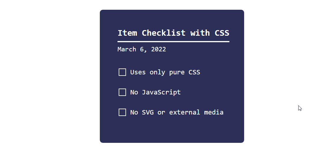
正如我在文章開頭提到的,CSS 正在穩步成熟。 這個動態清單的演示就是一個很好的例子。

它的工作方式是我們將checkbox輸入類型與:checked偽類一起使用。 並在:checked規範返回 true 時使用transform屬性更改狀態。
您可以使用這種方法實現各種目標。 例如,當用戶單擊特定複選框時切換隱藏內容。 它適用於單选和複選框等輸入類型,但也可以應用於<option>和<select>元素。
HTML
<div class="checklist"> <h2>Item Checklist with CSS</h2> <label> <input type="checkbox" name="" id="" /> <i></i> <span>Item #1</span> </label> <label> <input type="checkbox" name="" id="" /> <i></i> <span>Item #2</span> </label> <label> <input type="checkbox" name="" id="" /> <i></i> <span>Item #3</span> </label> </div>CSS
.checklist { padding: 50px; position: relative; background: #043b3e; border-top: 50px solid #03a2f4; } .checklist h2 { color: #f3f3f3; font-size: 25px; padding: 10px 0; margin-left: 10px; display: inline-block; border-bottom: 4px solid #f3f3f3; } .checklist label { position: relative; display: block; margin: 40px 0; color: #fff; font-size: 24px; cursor: pointer; } .checklist input[type="checkbox"] { -webkit-appearance: none; } .checklist i { position: absolute; top: 2px; display: inline-block; width: 25px; height: 25px; border: 2px solid #fff; } .checklist input[type="checkbox"]:checked ~ i { top: 1px; height: 15px; width: 25px; border-top: none; border-right: none; transform: rotate(-45deg); } .checklist span { position: relative; left: 40px; transition: 0.5s; } .checklist span:before { content: ''; position: absolute; top: 50%; left: 0; width: 100%; height: 1px; background: #fff; transform: translateY(-50%) scaleX(0); transform-origin: left; transition: transform 0.5s; } .checklist input[type="checkbox"]:checked ~ span:before { transform: translateY(-50%) scaleX(1); transform-origin: right; transition: transform 0.5s; } .checklist input[type="checkbox"]:checked ~ span { color: #154e6b; }使用:is()和:where()樣式化元素
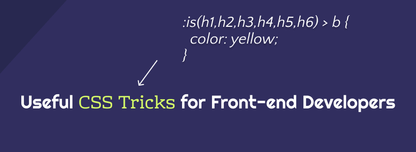
現代 CSS 框架的工作方式之一是使用conditional logic selectors 。 換句話說, :is()和:where()屬性可用於同時設置多種設計元素的樣式。 但是,更重要的是,您可以使用這些屬性來查詢您必須單獨指定的元素。
下面的 CSS 片段包括各種示例。 我添加了註釋來解釋每個查詢的作用。 您可以在 MDN 上了解更多信息::is() & :where()。
CSS
/* this query will select the b element within a heading and change its color. */ :where(h2,h3,h4) > b { color: yellow; } /* here we query the paragraph element for a footer that is nested inside an article. this lets us select specific parts of the design and style them accordingly. */ article :is(footer) > p { color: black; } /* want to create various styles simultaneously? the :where property can be used to select specific elements within a dynamic theme style. you can further nest the elements by specify (button,a) for example. */ .dark-button-style :where(button) { background-color: red; } /* the above query works for selecting multiple styles at once, too */ :is(.dark-button-style, .red-button-style) :where(button) { color: red; } /* here we select the h2 element which is located inside a specific div element */ :is(h2):where(.content-title) { text-transform: uppercase; } /* we can further improve the query by applying the changes to a specific subset */ .title-area:is(h2:is(.content-title)) { font-weight: 900; }使用關鍵幀的手風琴下拉菜單
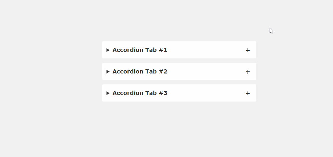
JavaScript 庫(jQuery、Cash 等)的問題在於,即使是小型函數,您通常也必須加載整個庫。 幸運的是,到目前為止,我們看到的許多 CSS 技巧都規避了這一要求。 就像這個手風琴片段的例子一樣。
如果您仔細了解當前的網頁設計趨勢,很快就會在登錄頁面上找到手風琴。 這是一種壓縮內容的簡單方法,否則會佔用設計空間。 常見問題解答、產品功能、使用技巧——很多信息類型都可以放在手風琴中。 這個片段展示了它在純 CSS 中的實現。
HTML
<main> <details open> <summary>Accordion Tab #1</summary> <div class="tab-content"> <p>your text goes here</p> </div> </details> <details> <summary>Accordion Tab #2</summary> <div class="tab-content"> <p>your text goes here</p> </div> </details> <details> <summary>Accordion Tab #3</summary> <div class="tab-content"> <p>your text goes here</p> </div> </details> </main>CSS
/* .tab-content can be styled as you like */ main { max-width: 400px; margin: 0 auto; } p { text-align: justify; font-family: monospace; font-size: 13px; } summary { font-size: 1rem; font-weight: 600; background-color: #f3f3f3; color: #000; padding: 1rem; margin-bottom: 1rem; outline: none; border-radius: 0.25rem; cursor: pointer; position: relative; } details[open] summary ~ * { animation: sweep .5s ease-in-out; } @keyframes sweep { 0% {opacity: 0; margin-top: -10px} 100% {opacity: 1; margin-top: 0px} } details > summary::after { position: absolute; content: "+"; right: 20px; } details[open] > summary::after { position: absolute; content: "-"; right: 20px; } details > summary::-webkit-details-marker { display: none; }懸停效果側邊欄
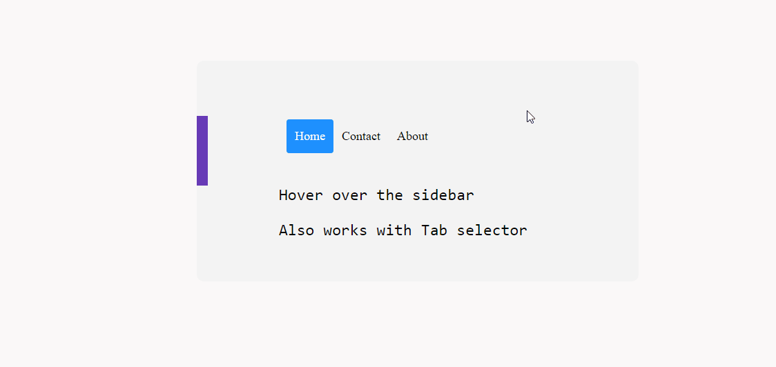
是否可以使用 CSS 實現動態懸停效果側邊欄? 絕對地。 再一次,這在很大程度上是可能的,這要歸功於像transform和:hover這樣的屬性。
至於兼容性,我在各種移動配置上進行了嘗試,它似乎工作得很好。 不過,它在桌面上可能會更好,因為移動屏幕會讓人感覺局促。
在實踐中,這種方法應該適用於position: sticky; 創建粘性側邊欄效果。
HTML
<div class="css-dynamic-sidebar"> <nav> <a class="" href="#">Menu #1</a> <a class="" href="#">Menu #2</a> <a class="" href="#">Menu #3</a> </nav> <div class="site-content"> <p>Hover over the sidebar</p> <p>Also work with Tab selector (for accessibility)</p> </div> </div>CSS
.css-dynamic-sidebar { overflow: hidden; position: relative; height: 15em; max-width: 15em; margin: auto; } .site-content { margin: auto; } nav { display: flex; flex-direction: column; position: absolute; right: 100%; padding: 1em; background-color: #f3f3f3; transform: translateX(1em); transition: 0.2s transform; } nav:hover, nav:focus-within { transform: translateX(100%); } a { white-space: pre; color: black; } p { font-size: 2em; font-family: monospace; text-align: center; }使用首字母的首字母大寫
在 CSS 中,可以選擇某些first-of-type元素。 並且,在本例中,我們以::first-letter偽類為目標來創建首字下沉效果。 這個類的好處是它讓我們可以自由地為我們喜歡的字母設計樣式。 因此,您可以調整 dropcap 的外觀以匹配您的設計。
說到這個屬性,你可以用它來做很多事情。 只要某個元素第一次出現在頁面上,就可以使用first-of-type單獨設置它的樣式。 但是,如下面的代碼片段所示——您也可以使用它來定位多個元素,儘管它們之前已經出現過。
CSS
/* here we target the .content-section wrapper and select the p element. then append first-of-type and target first-letter specifically. you can then reuse the same option in other parts of your design by changing the wrapper variable */ .content-section p:first-of-type::first-letter { color: #f3f3f3; float: left; font-size: 4rem; line-height: 4vw; padding-right: 8px; /* border: 0.25em double; */ } /* you can also add custom properties like border to create a creative dropcap effect, ideal for book presentations, etc,. */您還可以嘗試使用 line-height 屬性來正確地將 dropcap 與您的容器對齊。
使用 ::before 在按鈕前添加圖標
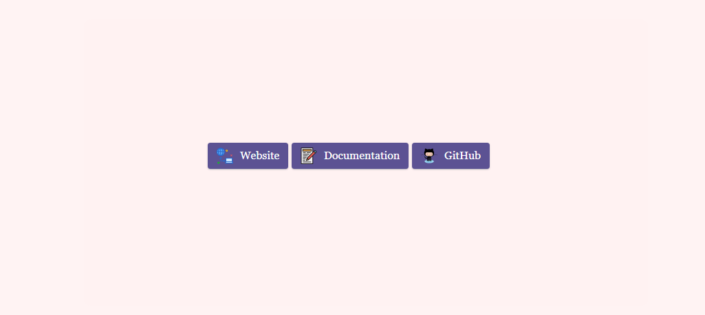
我創建此博客的目標之一是嘗試在顯示內容的方式上更具創意。 而且,因為我寫清單和各種綜述,我想確保它們具有個人風格。 我不是第一個或最後一個創建這樣的博客的人,但我認為自定義設計元素可以走很長的路。
而且,在這種情況下,每當我鏈接到外部資源時,我都會使用添加了自定義樣式的按鈕。 具體來說,帶有添加圖標的按鈕。 您可以通過簡單的 Google 搜索找到大量“按鈕生成器”,但我最感興趣的是擁有一個可以隨時重複使用的通用解決方案。
因此,為了實現我的目標,我為特定按鈕創建了一個自定義:before類。 澄清一下, content:"\0000a0"; 在此代碼段中,為 轉義了 Unicode。 .
您可以通過更改寬度和高度屬性來調整圖標大小,以反映您嘗試設置樣式的按鈕大小。
HTML
<div class="card"> <div class="card-body"> <a href="" target="_blank" class="wp-block-button btn btn-web btn-primary" rel="noopener">Website</a> <a href="" target="_blank" class="wp-block-button btn btn-docu btn-primary" rel="noopener">Documentation</a> <a href="" target="_blank" class="wp-block-button btn btn-gh btn-primary" rel="noopener">GitHub</a> </div> </div>CSS
/* select the global button design and then query the specific button class for which you wish to use the custom icon or image */ .btn-primary .btn-docu:before { content:"\0000a0"; display:inline-flex; height:24px; width:24px; line-height:24px; margin:0px 10px 0px 0px; position:relative; top:0px; left:0px; background:url(https://stackdiary.com/docu.svg) no-repeat left center transparent; background-size:100% 100%; }最重要的是,這些 CSS 提示和技巧突出了某些設計功能不需要 JavaScript 的潛力。 而且,好處是您可以在任何設計中實現這些技巧。 這些示例可以混合在一起,以實現更多的創意設計自由。
如果你喜歡玩 CSS,請查看我的 CSS Animations 專用頁面。 它仍在進行中,但我正在慢慢添加越來越多的動畫示例。 此外,我最近整理了一份關於如何在 CSS 中居中元素的指南。